Benchmarking official development assistance (ODA) for medical research, by recipient and by donor country
Published: January 2019
The Official Development Assistance (ODA) data are collected from the Organization for Economic Co-operation and Development (OECD).
ODA data are reported below for the year 2017 in US$. (Note: not all countries have reported data on this indicator)
See also:
What you see
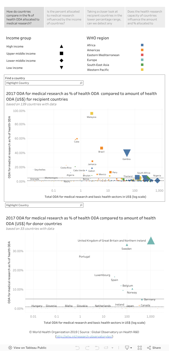
The data visualization compares ODA spent on medical research as % of (total) ODA spent on health (i.e. health ODA) in ODA recipient countries (top chart) and donor countries (bottom chart) against the global target (5%) set out in the 1990 report of the Commission on Health Research for Development (indicated by a horizontal line; an additional dashed line is also shown at 1%). The size of the country’s income group symbol indicates the amount of health ODA spent on medical research.
Four questions are explored (one in each of the four tabs at the top of the page):
- Tab 1: How do countries compare in the % of health ODA allocated to medical research?
- Tab 2: Is the percent allocated to medical research influenced by the income of countries?
- Tab 3: Taking a closer look at recipient countries in the lower percentage range, can we detect any relationships?
- Tab 4: Does the health research capacity of countries influence the amount and % allocated to medical research?
Points to note:
- The data are derived from 139 ODA recipient countries and 33 ODA donor countries for which data are available (i.e. a total of 172 countries).
- Malaysia spent nearly 95% of its health ODA on medical research, followed by Cuba (approximately 59%), Chile (approx. 59%), Brazil (approx. 47%) and Gambia (approx. 39%). (Tab 1, top chart)
- Apart from Gambia (a low-income country), all recipient countries that met the 5% target are high-income or middle-income countries. (Tab 1, top chart)
- The majority of recipient countries did not meet the target of spending at least 5% of health ODA on medical research, while several countries did not spend anything on medical research. (Tab 1, top chart)
- Among donor countries (tab 1, bottom chart), the United Kingdom (approx. 35%) followed by Sweden (approx. 33%) allocated the highest share of their health ODA to medical research.
- Overall, neither total ODA for health (tab 1) nor the level of GDP per capita (tab 2), seemed to influence the amount of ODA for health allocated to medical research in either recipient or donor countries.
- Taking a closer look at the data (see tab 3), countries that allocated relatively higher percentages of ODA on medical research (among those in the 0%-10% range) and spent relatively higher amounts (represented by the size of the symbol) on medical research are countries known to have existing capacity for health research, such as South Africa (5.72%; 6.95 million US$), Uganda (4.72%; 10.50 million US$), China (4.07%; 5.74 million US$), India (3.60%; 10.23 million US$), Kenya (3.01%; 7.45 million US$), and Nigeria (1.26%; 8.41 million US$).
- This is supported by the relationship between countries capacity for health research (measured by the number of health researchers per million inhabitants) and the % of health ODA allocated to medical research (tab 4). Countries which allocated a higher percent of their ODA to medical research also had a higher number of health researchers per million inhabitants such as Uganda and Kenya. (Note that data for both indicators are only available for 44 countries).
To explore the data further:
- Select a WHO region (from the top right key) and/or income group (from the top left key) to filter countries according to these categories, or select a country from the ‘Find a country’ dropdown list. Use your control key to select more than one category.
- Hover the cursor on a symbol in a graphic to see more information in a popup window.
- Undo the selection by clicking ‘undo’ or ‘reset’ near the bottom of the page or by clicking the same element again.
Data sources
- Indicator: UNESCO; OECD; Eurostat
- Country income group classification
- GDP