Official development assistance (ODA) for medical research and basic health sectors per capita, by recipient country
Published: February 2021
The Official Development Assistance (ODA) data are collected from the Organization for Economic Co-operation and Development (OECD) and are reported below for the year 2019 in US$ (not all countries have reported data on this indicator).
See also:
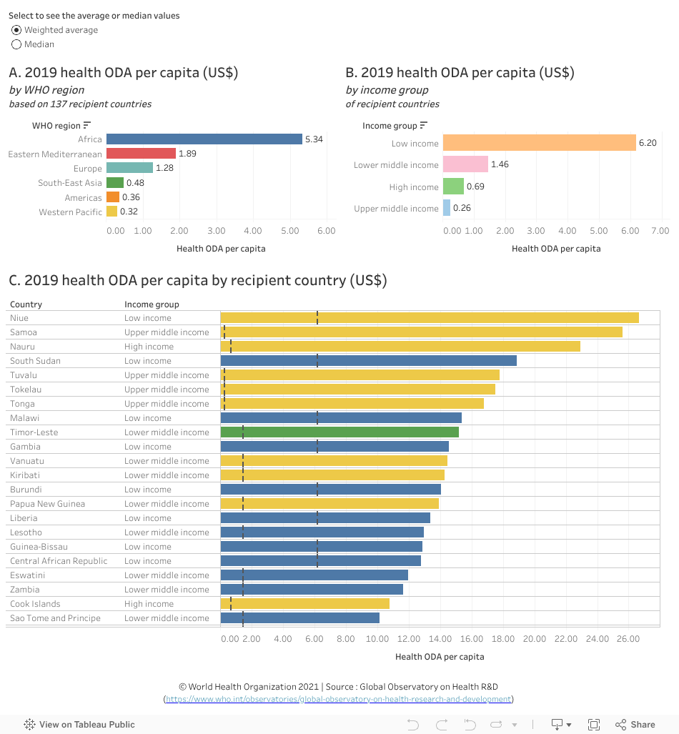
What you see
The data visualization compares 2019 health ODA per capita in US$ by recipient country (chart C). Weighted averages are provided by WHO region and country income group (chart A and chart B).
Data were derived using two calculation methods for analysis – ‘weighted average’ and ‘median’.
Points to note:
- The information on health ODA per capita is derived from 137 ODA recipient countries for which data are available. Due to the missing observations, caution is needed in interpreting the numbers.
- As in previous years, the Africa region (chart A) and countries in the low-income group (chart B) received the highest weighted average health ODA per capita compared to the other regions and income groups.
- However, if using median values, the Western Pacific region at the last position in weighted averages, comes first. This difference is accounted for by the large variability in both the amount of ODA for health received and the population in the countries of this region. For example, Niue, the top country in this region received 26.65 US$ per capita (0.04 million US$ in total) compared to 0.1 US$ per capita (3.48 million US$ in total) for Malaysia and 0.06 US$ per capita (91.05 million US$ in total) for China. (Select the Western Pacific region in chart A and explore the information by country in chart C by hovering on each bar).
To explore by country data (chart C) and differences with income group weighted averages or median (the income group weighted average or median is symbolized by a vertical dashed line and countries are color-coded by region):
- Select a WHO region (chart A) or an income group (chart B) to compare countries according to the category of interest. For example:
--Selecting only Africa shows in chart C that:- South Sudan (a low income country) received the highest amount of health ODA per capita (18.90 US$) compared to the other countries in this region with around 4 times more health ODA per capita than the weighted average for this region and income group and around 3 times the weighted average for its income group (Africa: weighted average 5.34 US$ per capita; low income: weighted average 6.20 US$ per capita).
- Namibia (an upper middle-income country) received 5.85 US$ health ODA per capita; although it is almost similar to the weighted average health ODA for its region, it represents 23 times more health ODA than the weighted average for its income group (0.26 US$ per capita).
- -- Selecting only the low-income group in chart B shows in chart C that while Niue received four times more (26.65 US$) health ODA per capita than the weighted average for this income group (6.2 US$), Democratic People's Republic of Korea, at the bottom of the list, received almost 10 times less with 0.63 US$.
- Click on the drop-down icon next to “WHO Region” (chart A), “Income group” (chart B) and “Country” (chart C) to sort the values accordingly.
- Hover the cursor on a bar in a graphic to see more information in a popup window.
- Undo the selection by clicking ‘undo’ or ‘reset’ near the bottom of the page or by clicking the same element again.